June 12, 2022
2022-06-12
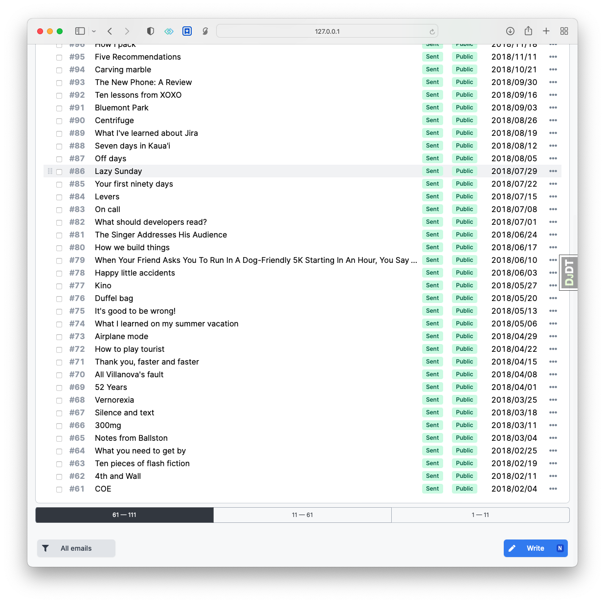
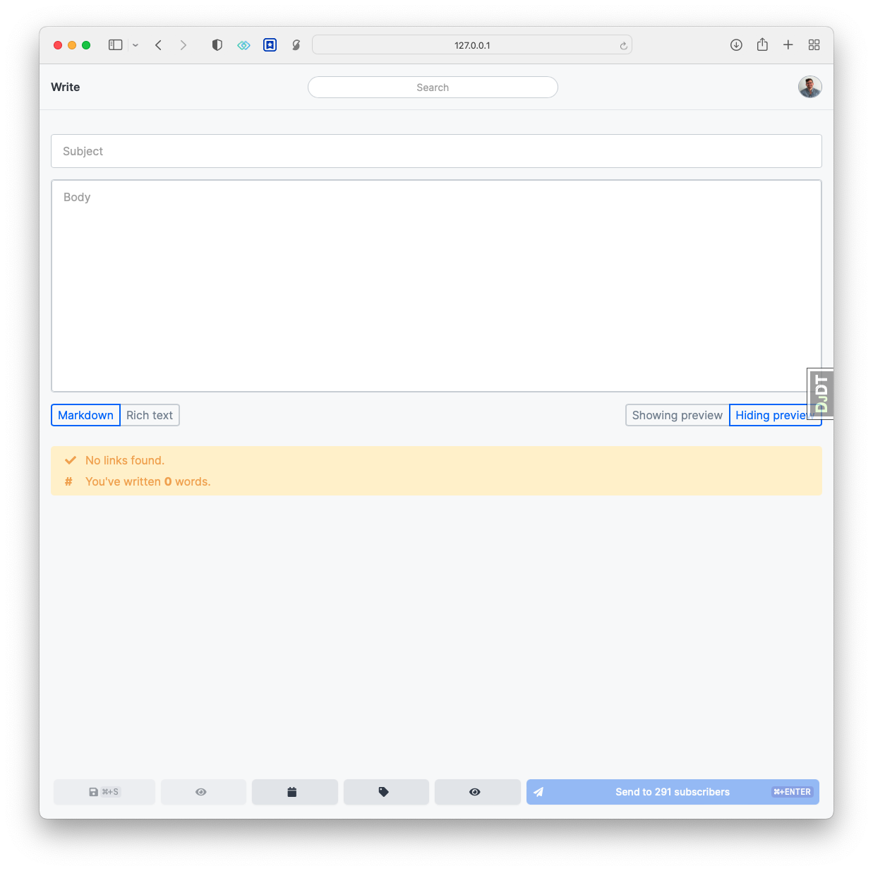
I wrote a few months ago about a critique by Brian Lovin (the best thousand dollars I’ve spent on Buttondown by a country mile!) and how it was dovetailing with some of my efforts to refresh Buttondown’s overall app scaffolding. That work has been slow but ongoing, and I wanted to chat about it a bit. First, the screenshots:


- I started out with a pretty mobile-inspired concept of dual actions: core CTA on the bottom right, ancillary actions on the bottom left. I think pinning core actions makes sense, but I’m not sure this scales; I’ll likely need to have a generic “actions” button in the bottom left to keep things uncluttered.
- One thing that makes this work a little harder than I’d like is that Buttondown’s front-end is split between a bunch of legacy SCSS and Tailwind. I’d love to wave a magic wand and get rid of all the SCSS (and I’m trying to make sure any files I touch get SCSS-purged), but this is one of the perils of trying to design a relatively old (and in some places, crufty) app in the codebase as I go.
- The elevation of the header to a three-tier thing (core header, universal search, and hamburger menu) is small. I go back and forth on whether or not having the search bar as such a prominent affordance is useful; it’s tempting to just have an icon that pops up a modal, which would certainly make the design quieter.
There is a lot left to be done. I want to make the sidebar look — how should I phrase this? — less janky; I want to finally unshackle the app from its default full-width constraints; I want to make sure this all plays nicely on mobile viewports, which have been hitherto underdeveloped. But it’s closer to being shipped than it is to being started, so to speak, and I wouldn’t be surprised if I get it across the finish line by the end of the month.
That being said… this refresh is less about the direct benefits it garners and more about the investment opportunities it unlocks. I want to be able to make the writing pane take up the full screen; I want to have nested subviews for subscribers and emails (rather than the overstuffed modals that currently exist). I find myself with a bit of trepidation just working on this branch in isolation for exactly that reason — I’m going to be, sooner or later, merging a fairly big UI change with little that I can point to in terms of direct benefit. (I guess the hotkeys? Everybody loves hotkeys, right?)
In other news
I suppose this week is about sharing half-baked screenshots, which is symptomatic of most of my “core” goal (trimming down the backlog to <200 items from ~300 by the end of the month) being fairly unfocused.
So here’s a peek at a new marketing site:

I’m pretty excited about this! Most of the copy is going to stay the same, but I’m shifting to a new stack (so the core Django application doesn’t also have to power the marketing material), a new font, and some slightly more aggressive visual branding. (I mean, do you see the size of that <h1> tag?)
Don't miss what's next. Subscribe to Weeknotes from Buttondown: