July 14, 2020
2020-07-15
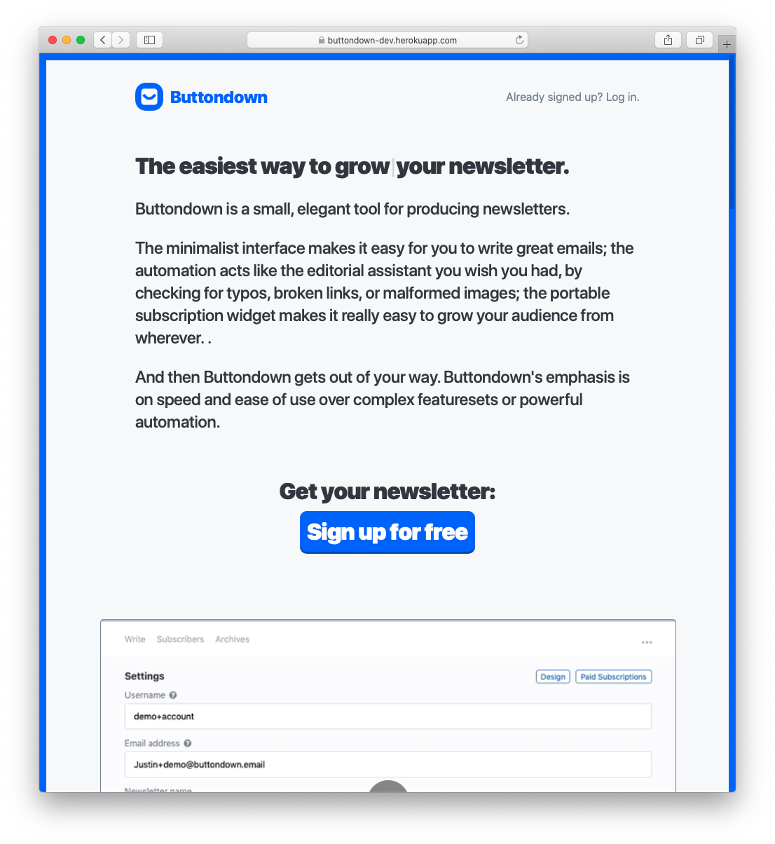
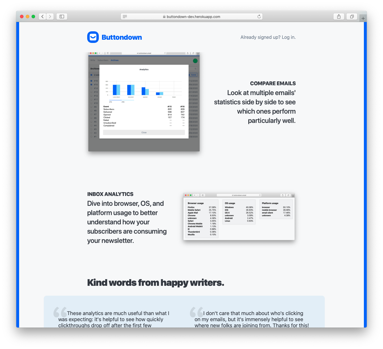
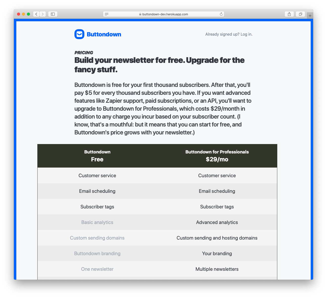
Marketing V3, almost ready.
Feast upon these glorious screenshots:
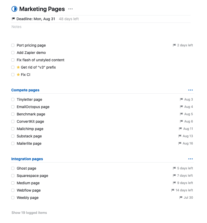
And here’s what the task list looks like:
I can earnestly say this is the most effort I have spent on marketing (even if it’s frontend engineering disguised as marketing) in a long time.
I am grateful to my partner, who has been the taskmaster behind this: her skills as a PM (and, Haley if you’re reading this I love you, but also as a scold) made me do this because lord knows I would have bailed out of this many consecutive weekends recording demos and taking screenshots.
The goal is to launch next weekend, with a followup of adding compete pages and integration pages throughout late July and August. If it slips I am not particularly worried.
The question starts to drift towards “well, how do you track efficacy?”. My answer to that is going to evolve over time, but right now it is a pleasant ignorance: I think this new marketing site is better and I do not care about what the data will say. It looks better; it has more information; it is more interesting. Tracking the uptick in traffic and conversions feels like a vanity metric (more about that later).
Internationalization, less ready.
The internationalization work is less mature but is growing well. Since last week, I have created a relatively reasonable plan of getting things live:
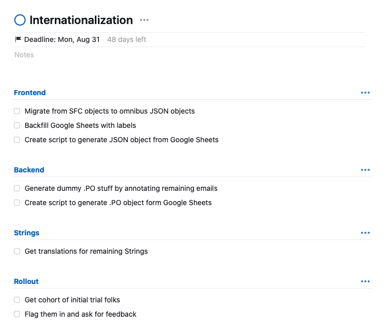
I am, candidly, very worried that this is overengineering and that actually I should just manually stitch together a bunch of translation files and call it a day. I have not changed the vast majority of these strings in eighteen months: chalking up the automation of this work to 2022 Justin seems eminently reasonable.
But I’m going to give it some time to bake out for now: the important work is in the labeling and finding translations, and both of those are largely independent of how I end up engineering this thing. But I’m excited: I am confident in the paths forward, even if I don’t know which path exactly I’m going to take.
Aspirational dashboarding.
I have written before that I really enjoy bug fixes. This is largely because I have tricked my animal brain into thinking about bug fixes in a very specific way: bug fixes are a way to grow the test suite. Buttondown’s test suite should grow monotonically larger over time, accumulating more and more nuances, and bug reports (and subsequent fixes) are a way of reifying logic into the codebase.
Why don’t we have testing dashboards and testing vanity metrics? I don’t mean this as a completely flippant question: I have worked at a number of very large and very small organizations and none of them build out dashboarding around testing and acceptance the way they would about, say, product engagement or uptime.
I have been thinking about what a dashboard for Buttondown’s testing and reliability would look like. (Let me assure you that this is theoretical: it’s hard to justify actually spending the time here except under grounds of “it would be fun”.). The things I would want to include:
- Size, obviously.
- Flakiness over time.
- Test mutability over time.
- Coverage percentage.
- Back-testing accuracy. (What percentage of untested code is justifiable, versus what percentage ends up biting me in the ass?)
Don't miss what's next. Subscribe to Weeknotes from Buttondown: